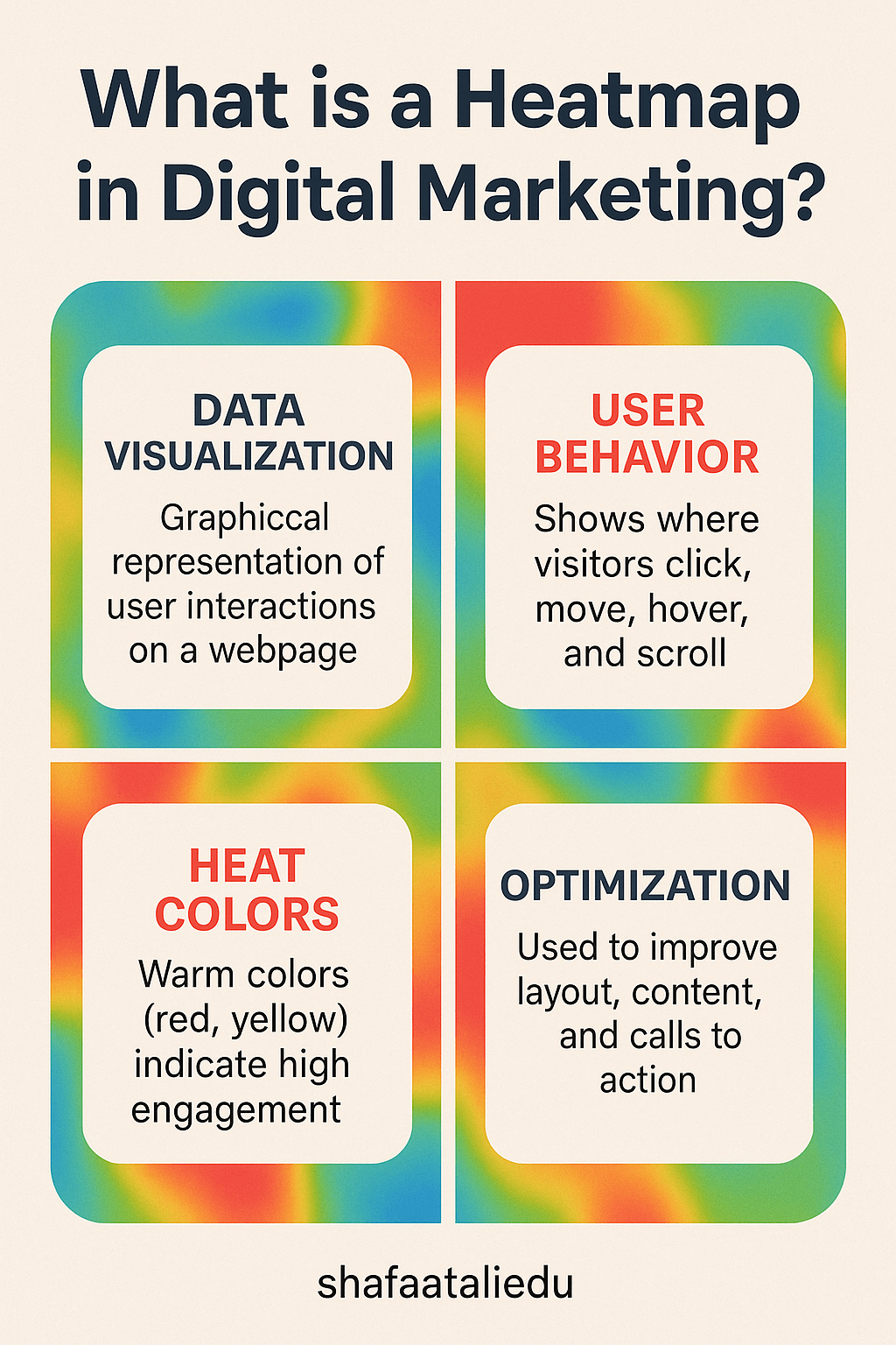
A heatmap in digital marketing is a visual tool that shows where users interact most on a webpage. Think of it like a weather heatmap, but instead of showing temperatures, it reveals user behavior—where they click, move their mouse, or scroll the most.
Imagine your website is a store. A heatmap tells you where shoppers are spending time, what products they glance at, and where they drop off. Areas with lots of activity are usually shown in “hot” colors like red and orange, while less active areas appear in “cool” colors like blue or green.
There are three main types of heatmaps:
- Click Heatmaps – These show where users click the most. Useful for spotting popular links or buttons.
- Scroll Heatmaps – These reveal how far users scroll down a page. If most visitors stop halfway, your content might be too long or not engaging enough.
- Mouse Movement Heatmaps – These track where users move their cursor. Often, cursor movement correlates with attention and reading patterns.
Heatmaps help marketers improve website design, content placement, and user experience. For example, if users aren’t clicking a “Buy Now” button because it’s below the fold, a heatmap can reveal this—and you can move it higher for better results.
They’re especially useful for A/B testing. Let’s say you’re testing two versions of a landing page. A heatmap can show which version keeps users more engaged or guides them more effectively toward conversion.
In short, heatmaps turn user behavior into colorful, easy-to-read visuals that help optimize digital marketing strategies.
As digital experiences become more interactive, heatmaps will likely evolve to track even deeper engagement patterns. Stay curious—they’re only getting smarter!

Leave a comment